The Problem
Mental load affects the effectiveness of day to day tasks, leading to physical and mental exhaustion and losses in planning, childcare, finance, freedom, time, and sometimes career.
One identified cognitive labour that often goes unnoticed is the planning and execution around household groceries. Planning may include taking stock of pantry items, planning meals for the week, and making a grocery list, while execution may include going to the store. These small, recurring tasks accumulate into a heavy invisible load.
Defining Mental Load
Mental load combines two distinct kinds of work: cognitive labour and emotional labour. Both are largely invisible, both are demanding, and both shape how it feels to manage a household.
Emotional labor is the work of managing the emotions of oneself and of others.
Cognitive labor is organizing, thinking, planning and executing work.
Why I picked the problem of cognitive load around groceries
Among the many forms of cognitive labour, household groceries stood out as a domain with a clear, repeatable cycle, plan, decide, execute, and one that almost every adult navigates weekly. It is concrete enough to design for, and universal enough to matter.
If we can design tools that anticipate needs, surface options, and make decisions easier, we can meaningfully reduce the cognitive labour of grocery planning, and free up the time, energy, and headspace it currently consumes.
My approach in validating the problem
To validate the problem, the initial step was a systematic literature review. I reviewed existing research and gathered evidence to ground the UX research that would follow.
Nine Domains of Cognitive Labor
A study by the American Sociological Association demonstrates that cognitive labor includes anticipating needs, identifying options for filling them, making decisions, and monitoring progress. Such work is exhausting but often invisible.
The study identified nine cognitive labor domains:
Highlighted: the focus area for Grocery Buddy.
Four Types of Cognitive Labor
Within each domain, the study identified four distinct types of cognitive labor. Each represents a different mental shift, and an opportunity to support the user.
User needs found from literature
Pulling these labour types into a real scenario, the study followed a parent named Bram through a single morning. His routine illustrates how a single grocery decision is rarely just one thought, it's a chain of them.
Each step in Bram's morning is a small act of cognitive work. Stacked together, they represent the kind of invisible labour Grocery Buddy is designed to lighten.
User expectations
Across the literature, three consistent expectations emerged. Users want products that help them see things coming, act with confidence, and stay in the loop with the people they share their lives with.
Grocery Buddy's product principles map directly to these three needs, anticipation, support, and transparency become the spine of every feature, from pantry tracking and smart suggestions to shared family lists.
Introducing a solution
Below are the everyday questions the application is designed to answer, questions users ask themselves, often without realizing they are doing cognitive work.
The focus of the application is to ease the cognitive load, realistically, you cannot remove or make it disappear, but you can help users carry it more lightly. While doing that, the application itself should perform in a way that eases the load rather than creating another pressure.
So the application should be:
The Mobile App
To solve the user-expected questions, the easiest idea was to use a mobile application which is easily accessible at all times. At the first stage, the process was scribbling on paper prototypes with all possible use cases and edge scenarios.
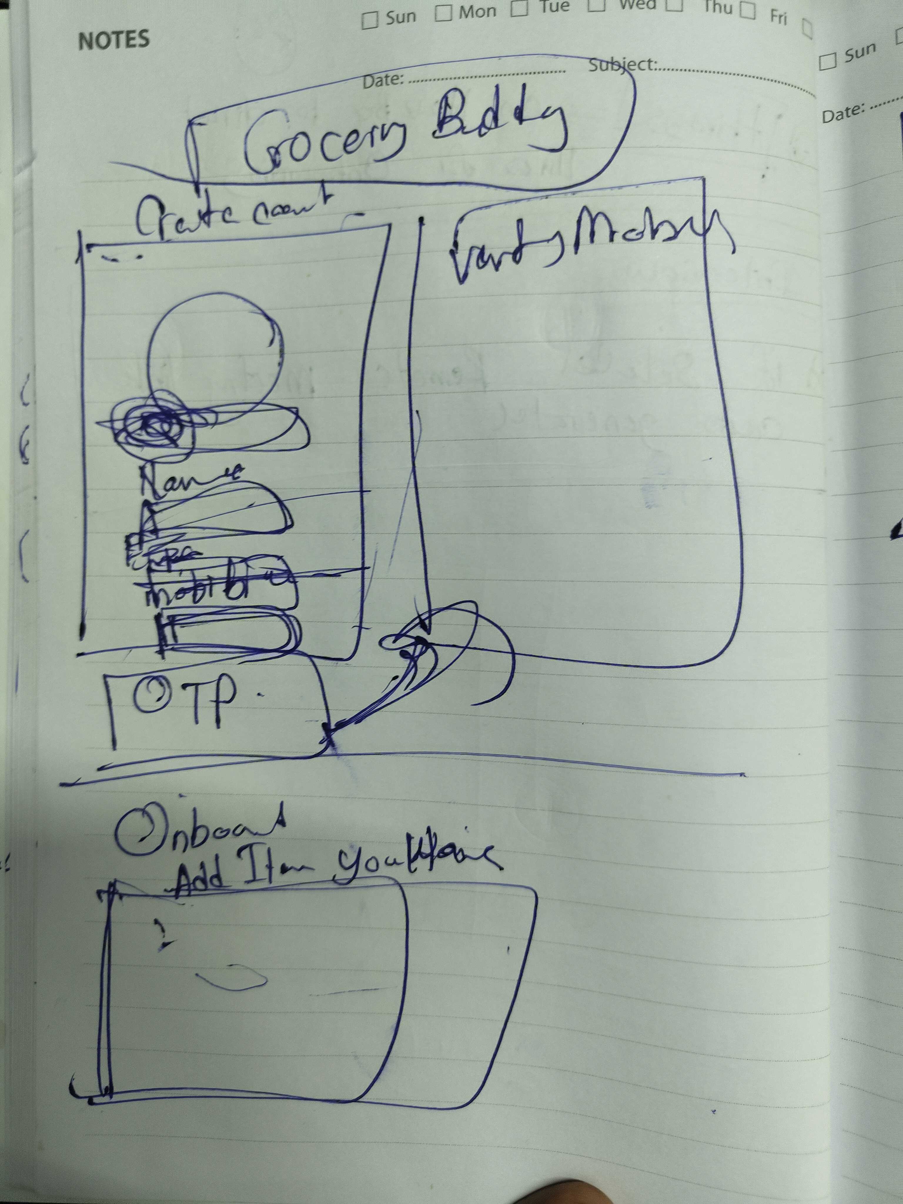
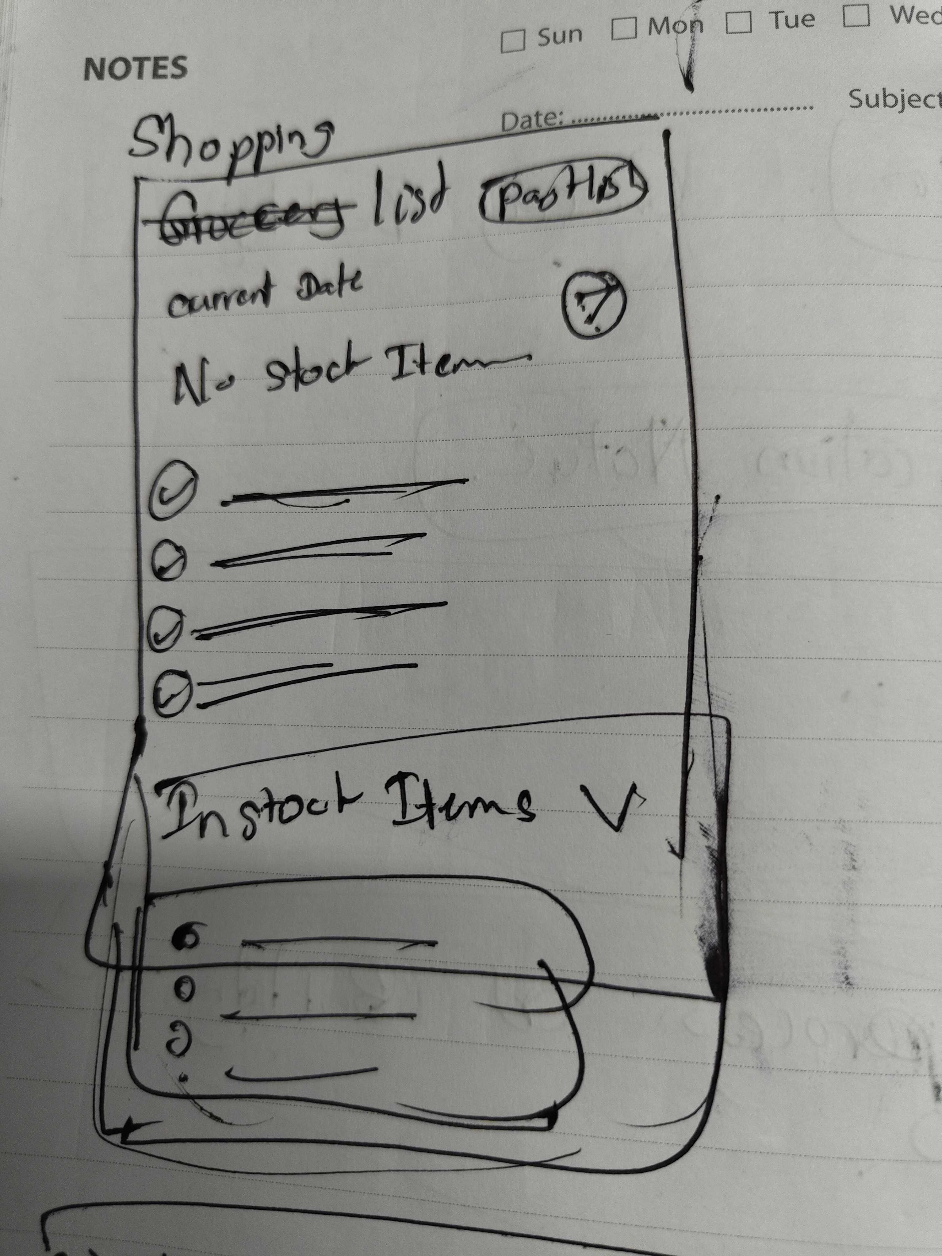
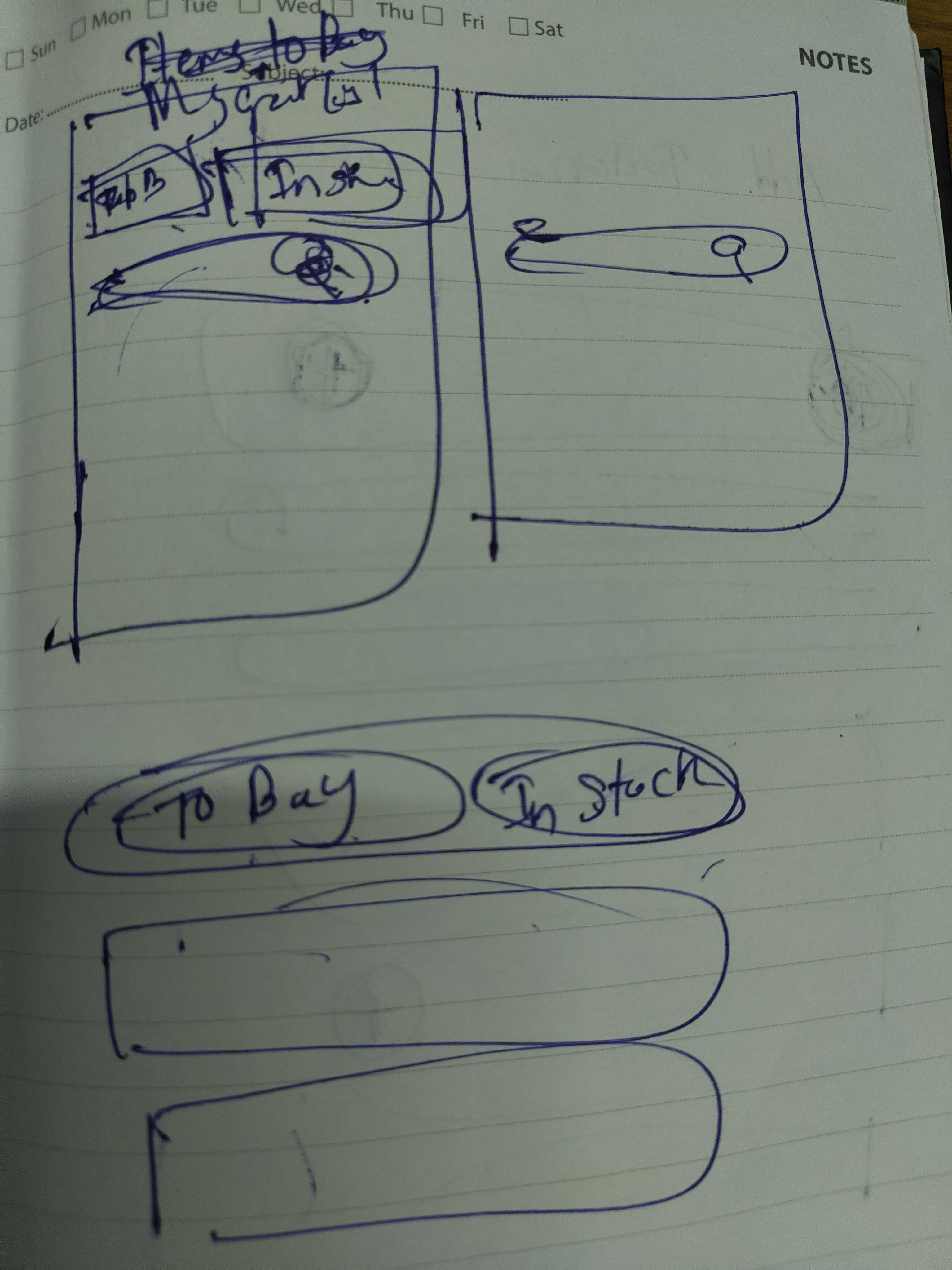
Initial User Flow
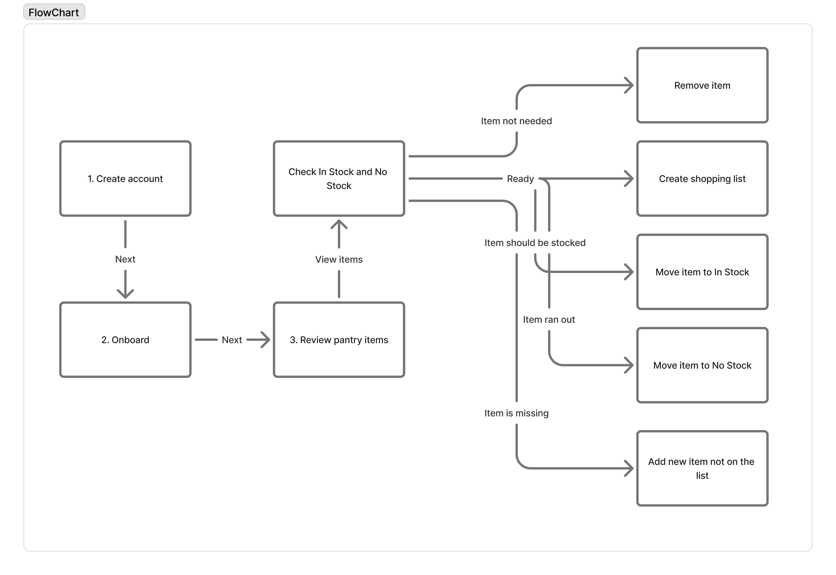
After a long series of thinking through scenarios and scribbles, the first version of the flow was drawn. The initial user flow diagram was created with FigJam.
Ideation with Stitch
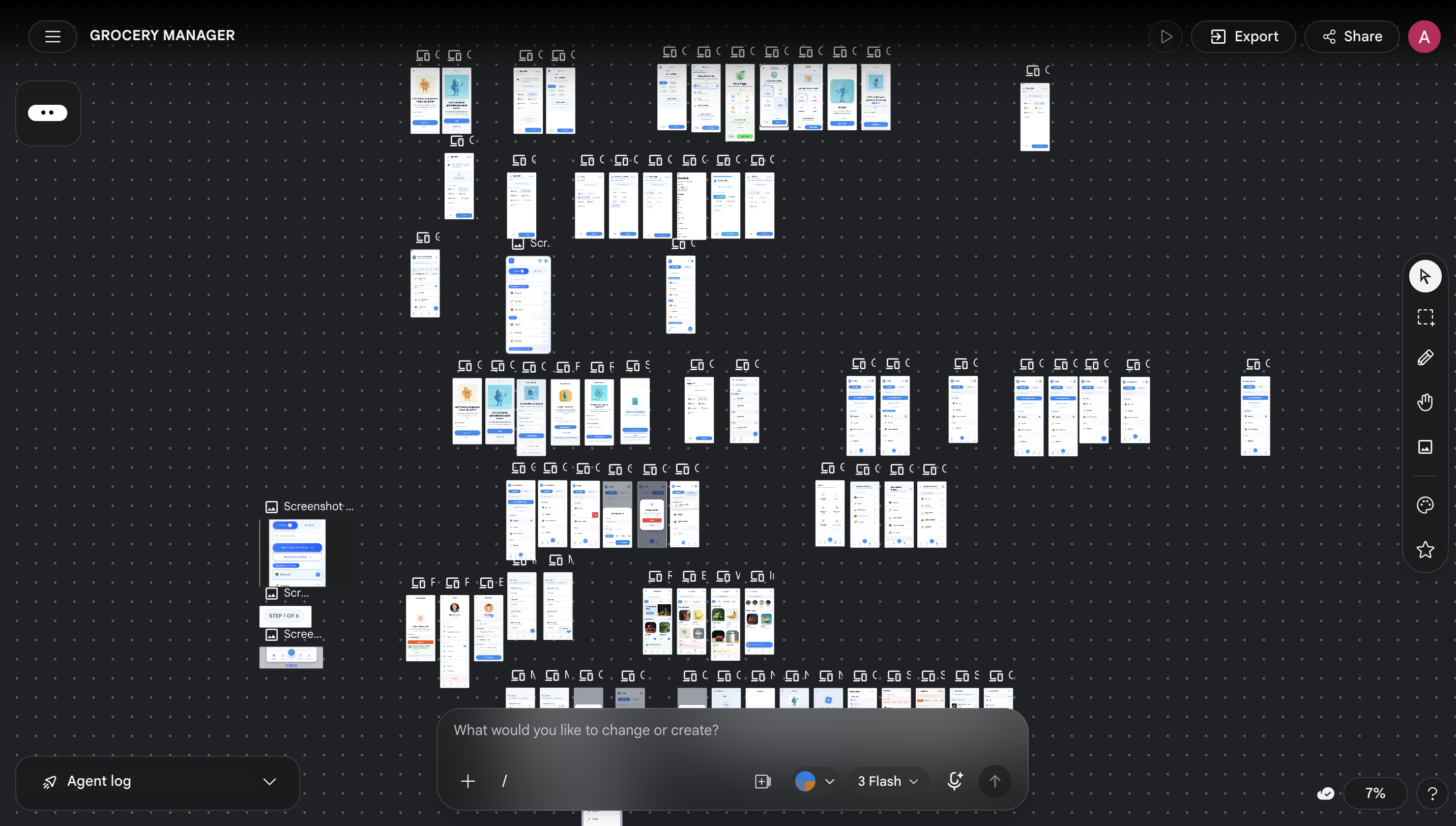
Next was using Stitch (an AI design tool) to ideate the vision of the application. A large collection of ideation was done to visualise the initial vision.
From Stitch to Figma
Selected UIs were then exported to Figma, and the proper UIs were created one by one, refining typography, spacing, components, and interaction states against the design principles defined earlier.
The Application
.png)
An application that helps in managing:
-
01
Live Inventory Keep a real-time view of what is at home and what has run out.
-
02
Visibility Surface needs and shared lists transparently across the household.
-
03
Decision Making Reduce the load of choosing, what to buy, when to go, and what to skip.
How the Application Works
A walkthrough of the key flows, onboarding, inventory management, list building, and sharing, and the small decisions behind each one.
Onboarding & Household
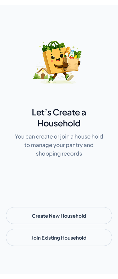
Users can create an account and create a household, then invite members so that everyone has transparency and shared execution over the same household inventory.
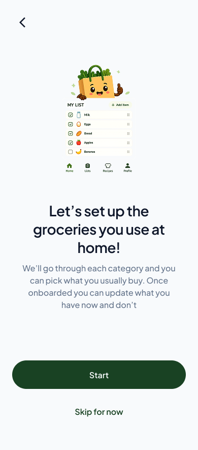
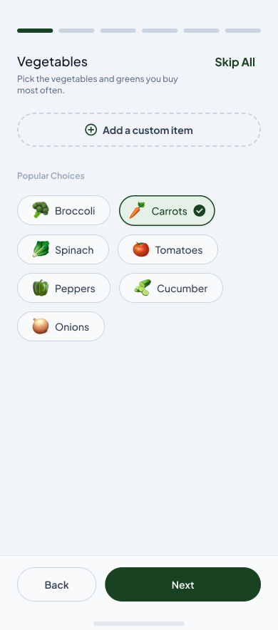
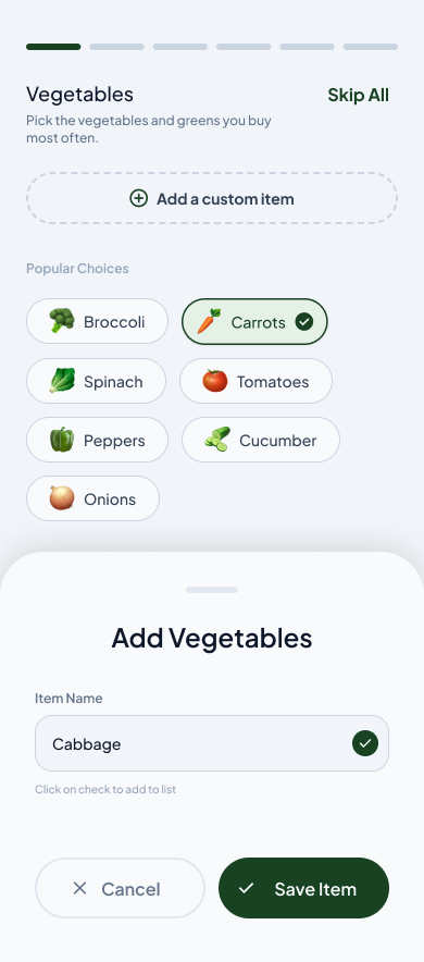
Add Items in Onboarding
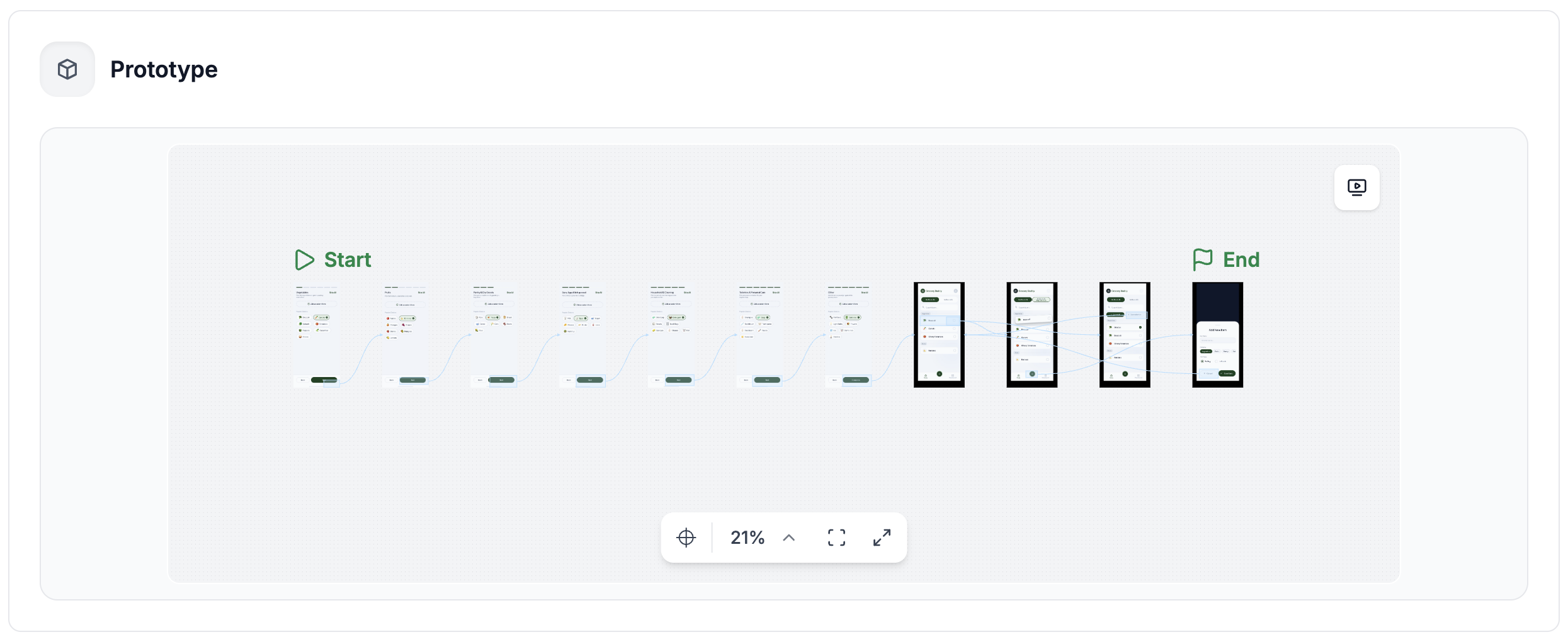
In a few guided steps, users add the items they regularly use to their inventory. Once onboarded, all items start in No Stock, the user can then walk through their household and mark what is currently in stock.
Realtime Inventory Updates
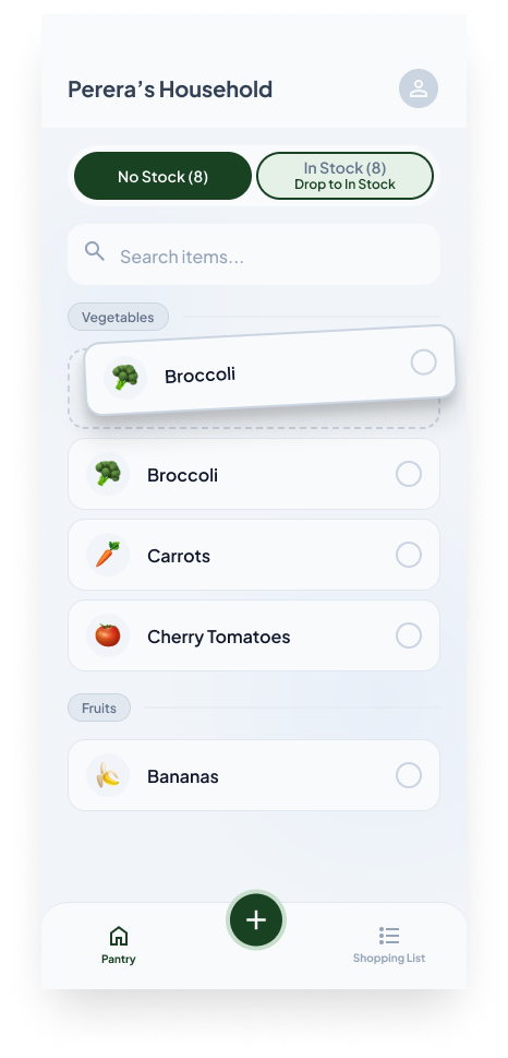
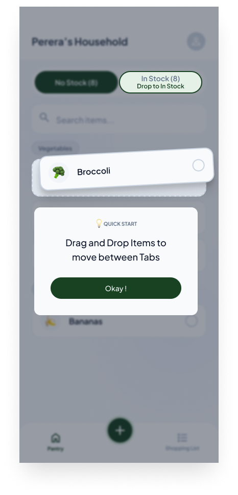
Ran out of an item? Quickly drag and drop it to No Stock. Back from a grocery haul? Mark it as In Stock while tidying the groceries away. The inventory stays accurate without becoming a chore.
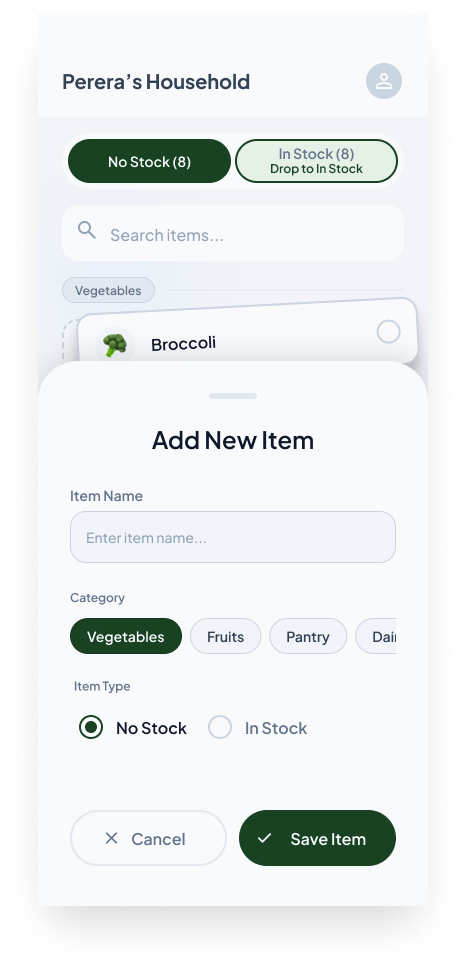
Add a New Item
Decided to try something new? Users can add new items to the inventory at any time and mark their current status, keeping the household pantry honest as it evolves.
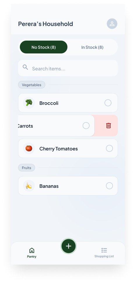
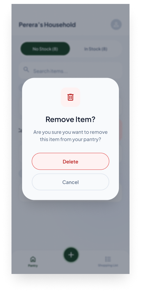
Remove an Item
No longer buying something? A simple swipe on an item reveals a remove action, with a confirmation step to avoid accidental deletes.
Building a Grocery List
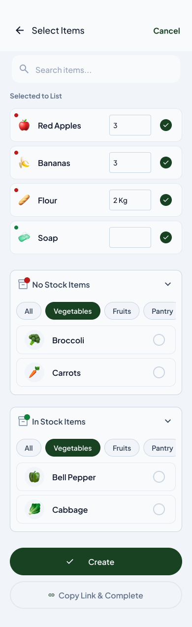
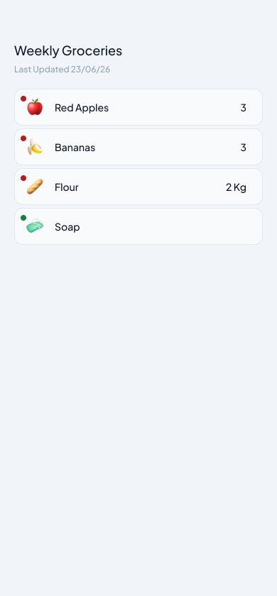
Rather than walking up and down the house trying to remember what you need, users can build a grocery list from what is already tracked, based on what they have and what they don't.
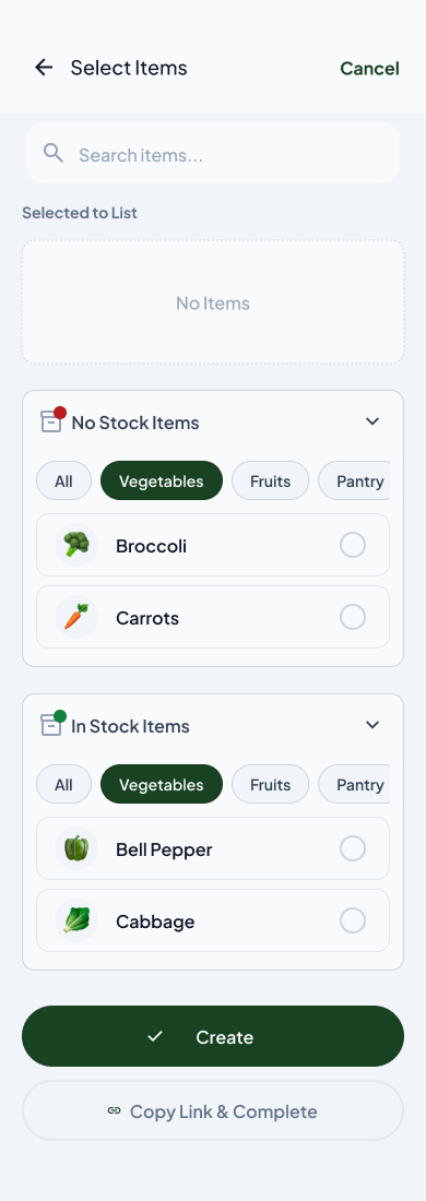
What mental model does the user already have walking into a store? Most people use one of three: a mental picture of their fridge, a scrappy notes-app list, or nothing and they browse. The app needs to match one of those models, not impose a new one. Hence the list mirrors the real-life action, and the mental picture now lives inside the app, relieving the memory squeeze.
Share the List
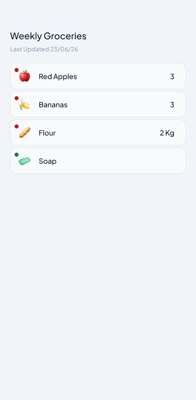
Users can copy the link and share the grocery list through any platform. When the recipient clicks the URL, the list items open directly, making it easy to pass the run to whoever is nearest the store.
How the App Answers User Expectations
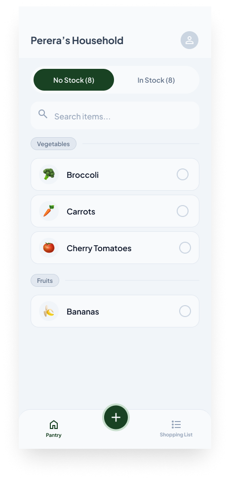
Mapping the original user questions (from Section 09) back to the screens that resolve them, each screen below sits at the centre of the conversation, with the questions on the left and the lived-in answer on the right.
Testing for Usability
Usability testing approach
Usability testing was done to identify user flow gaps and issues. The approach taken was testing carried out by synthetic users, AI user personas we can use to run user testing and validation.
Synthetic users are very useful when you are not able to find actual users for initial validations. The approach has its own ups and downs, but for testing flow and usage, synthetic users are enough and fast.
For this case study I used a tool called UXia, which has a collection of personas to run the application through. To begin, a test case and a prototype around it were created. Then, after selecting the audience, the test was executed.
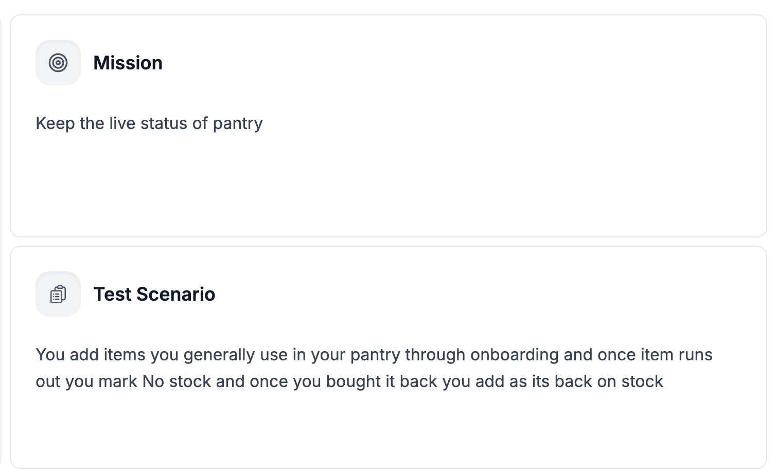
Test case & mission
Prototype flow
Findings & fixes
Each finding from the synthetic user runs is paired with the user story that surfaced it and the design fix that followed.
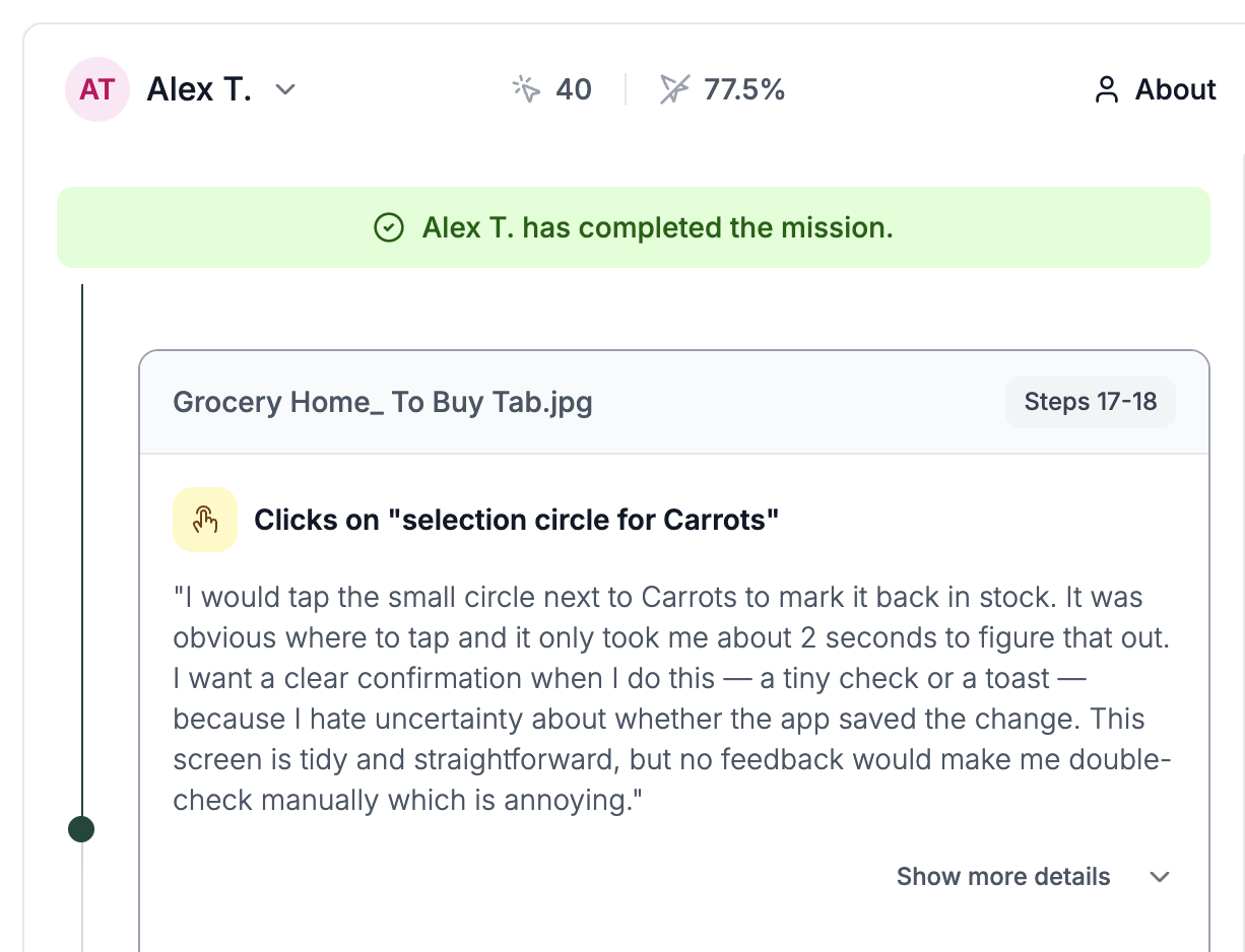
Feedback is necessary
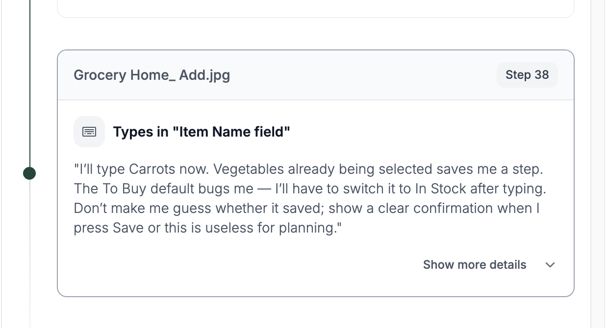
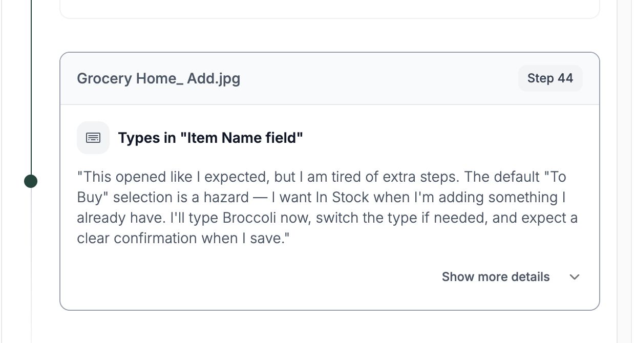
Synthetic testers tapping items to toggle stock status expected an immediate confirmation. Without it they felt uncertain whether the change had saved, leading to manual double-checking that erodes the "fast and easy" promise.
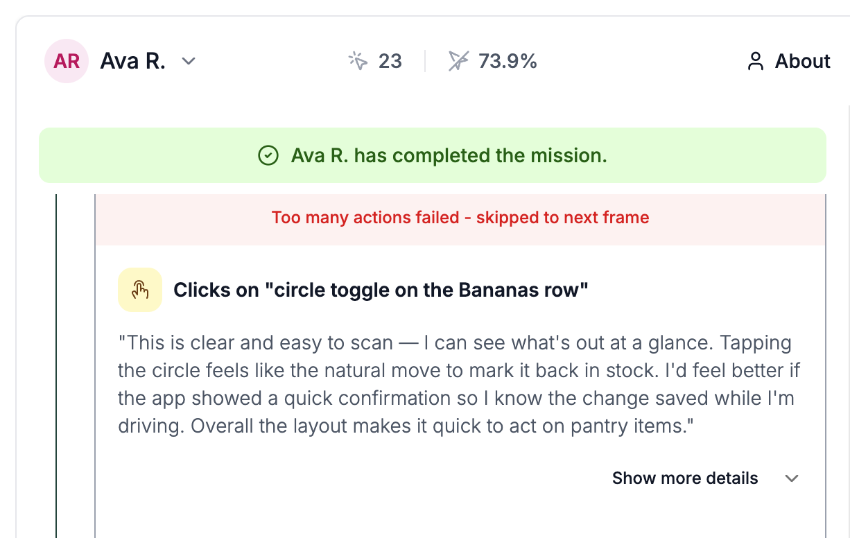
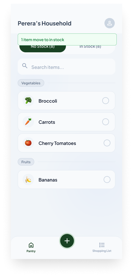
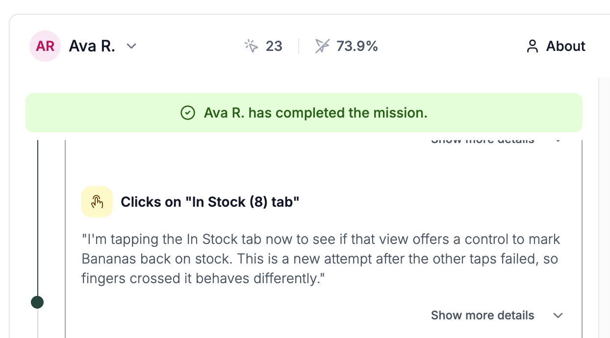
Users do not know how items move between In Stock and No Stock
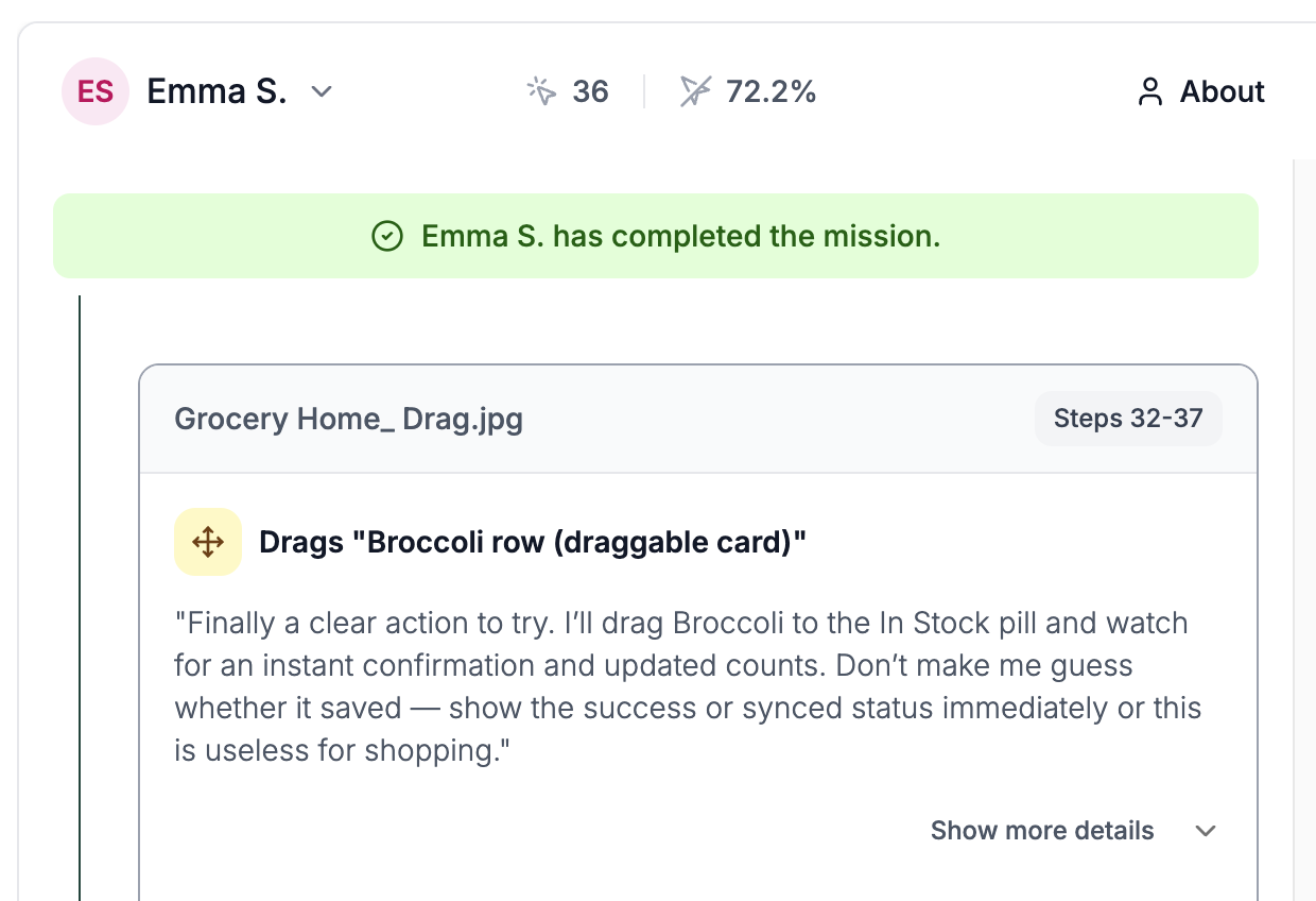
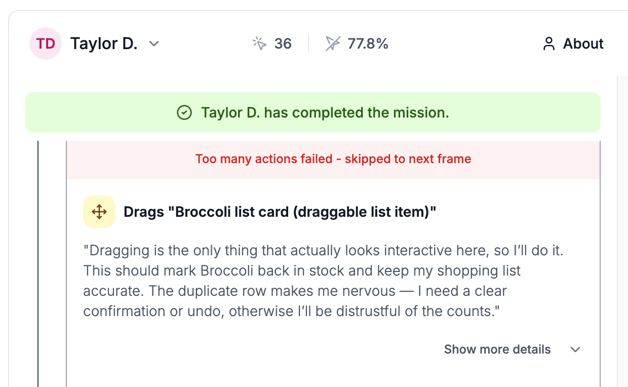
It is clear that users can drag and drop items, but figuring out that dragging is how you move them between tabs is not obvious at first. Synthetic users kept reaching for the toggle, the tab, or the row before discovering the drag gesture.
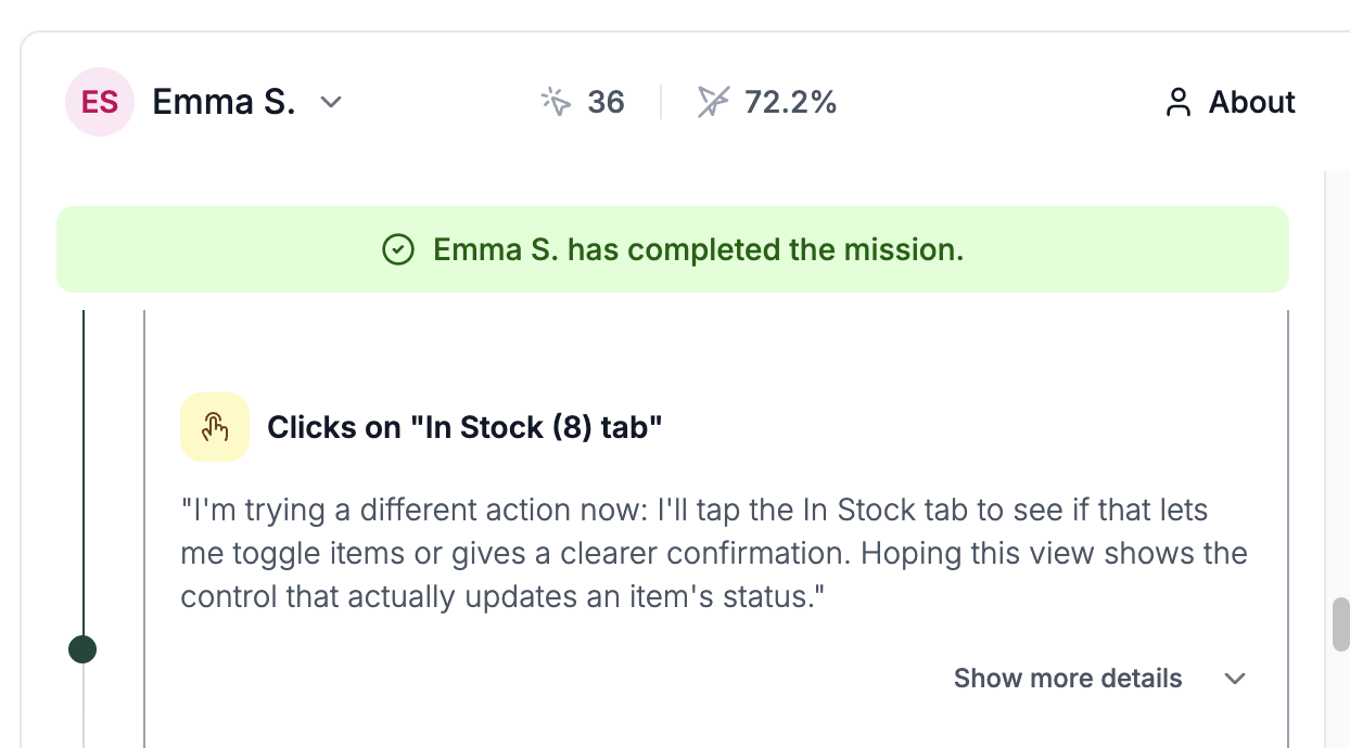
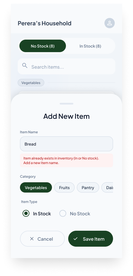
Validation for duplication & default status selection
When adding a new item, the system should prevent a duplicate of an existing one. Another fact is that human logic also says you add a new item when you already have it, not when you don't, so defaulting the status to In Stock makes more sense than To Buy.